
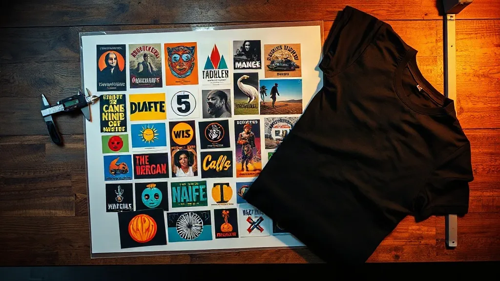
Most print shops lose money on DTF not because the transfer fails, but because the gangsheet was planned badly. You finish a run of Shaka Wear tees, peel the film, and realize you squeezed eleven designs onto a sheet that should have held fourteen, or the artwork sits too close to the trim line and the cutter eats a corner. This guide is about the part nobody photographs for Instagram: the sheet itself. How to lay out a DTF Gangsheet Builder around shaka wear blanks so the numbers work, the prints land clean, and the press operator doesn't have to improvise at 9 p.m.
Why Shaka Wear Blanks Change Your Sheet Math
A gangsheet is only as efficient as the garment it's built for. Shaka Wear runs heavier than the average promotional tee, and that weight changes a few practical things about how you plan a sheet.
Heavier cotton and cotton-blend jersey don't stretch the way a 4.1 oz ring-spun does under the heat press. That's good news for DTF, because the print sits on a stable surface and the adhesive cures evenly. But it also means the shirt itself has more body, so a chest print that looks proportional on a light tee can read small on a 6.5 oz heavyweight. When you're building a sheet for a streetwear drop, size the artwork for the garment, not for the file preview.
The second factor is shrinkage. Heavyweight blanks tend to move a little more after the first wash than people expect. If your customer is going to wash a tee three times before the print really settles into its final look, plan your placement with a small buffer. I keep chest prints at least 3 inches below the collar seam on heavier blanks so a slight upward shift after washing doesn't crowd the neckline.
None of this is a knock on the blanks. It's the opposite: heavier fabric gives DTF a better home. You just have to stop treating every garment like it's the same 5 oz tee you printed last week.
Planning a Gangsheet That Actually Fits
Here's the part where most shops eyeball it and regret it. A gangsheet is a fixed rectangle. You pay for the sheet, not the designs on it, so every square inch you waste is money you handed over for nothing.
Start with the trim and bleed, not the artwork
Before you place a single design, map out the safe zone. Most DTF films need a small trim margin around the outer edge, and each individual design needs a few millimeters of clearance so the cutter has something to grab. I lay out a sheet in three layers: the outer trim margin, a 3 to 5 mm gap between designs, and then the artwork itself. If you skip the gap, two designs can fuse at the edge during pressing and you end up peeling a corner of one print while trying to separate them.
Group by size, then by quantity
A sheet doesn't need to be one order. If you're printing for three clients on the same day, group the designs by transfer size first. A row of 10-inch back prints takes a different footprint than a stack of 3-inch left-chest logos. Put the large pieces down first, then fill the leftover strips with small logos. That leftover space is where your margin lives.
Quantity matters too. If a client orders forty shirts but you only need thirty-eight transfers after accounting for a couple of press failures, don't fill the sheet to the edge just because the space is there. A little breathing room on the sheet means a cleaner cut and fewer rejects.
Rotate before you resize
When a design doesn't fit, the instinct is to shrink it by 5 percent. Resist that. A 5 percent reduction is invisible on screen and very visible on a shirt, especially on lettering. Rotate the design 90 degrees first. A tall design often fits sideways in a gap you thought was unusable, and you keep the print at the size the client approved.
File Setup That Survives the Press
Once the layout is set, the file itself decides whether the print looks sharp or muddy. A few settings matter more than the rest.
- Resolution: 300 DPI at final print size. Not 300 DPI at some arbitrary canvas size that gets scaled up later.
- Color mode: RGB for the artwork, since DTF printers work in RGB. Converting to CMYK first tends to dull saturated colors, especially reds and oranges on streetwear graphics.
- Transparency: flatten it. A transparent background can produce a faint halo around the print edge that only shows up after pressing.
- White underbase: let the RIP generate it rather than building it manually. Manual underbases drift out of alignment with the color layer and cause a visible white edge.
If your artwork has fine detail, thin lines under 1 pt, or small text below about 8 pt, test it on a scrap before committing to a full sheet. DTF handles detail well, but it isn't infinite. On a heavyweight Shaka Wear tee, a thin line that looked crisp on film can soften slightly against the fabric texture. Slightly bolder linework usually reads better on the garment even if it looks a touch heavy on screen.
Costing a Sheet So You Don't Work for Free
This is where the sheet becomes a business decision. The DTF Gangsheet Builder gives you a fixed cost for a fixed area, so your job is to spread that cost across as many sellable prints as possible without hurting quality.
Do the math per design, not per sheet. Take the total sheet price, divide by the number of usable transfers, and add your press time, film handling, and a small waste allowance. If that number is above what you charge for the print, the sheet was laid out badly, not priced badly. I've watched shops quote a job at a loss simply because they left a third of the sheet empty and never noticed.
Press time is the hidden cost. A 10-inch back print takes noticeably longer to press than a 3-inch chest logo, and a full sheet of back prints can turn a two-hour job into a four-hour one. When you're quoting, count the press cycles, not just the prints.
Pressing DTF on Heavier Shaka Wear Blanks
Pressing technique is where heavyweight blanks reward you for paying attention. A few practical notes from the shop floor:
- Pre-press the shirt. Thirty seconds on the heat press to flatten wrinkles and drive off moisture. Skip this and you'll get a print that looks fine cold and develops a bubble after the first wash.
- Use firm, even pressure. Heavier fabric needs the adhesive to penetrate the weave, so don't go light. A medium to firm setting works better than a soft touch on a thick blank.
- Peel cool for matte finishes. Cold peel gives a flatter, softer hand on heavyweight cotton, which suits the streetwear look. Warm peel is faster but can leave a slightly glossier surface.
- Post-press for durability. A short second press under a cover sheet locks the print in and improves wash resistance noticeably.
If you're printing a batch of the same design across multiple sizes, press one shirt per size first before running the full batch. Sizing differences on heavyweight blanks can shift where the print lands relative to the collar, and it's cheaper to catch that on one shirt than forty.
When to Build a Sheet and When to Order Singles
Gangsheets make sense when you have volume or variety. A shop running a 40-piece drop with four designs is a perfect fit. A customer who wants one custom tee for a birthday is not. For single pieces, a small pre-printed transfer or a direct-to-garment option is usually cheaper and faster. The gangsheet wins when the sheet is full, and it loses when you're paying for empty film.
The other case for a sheet is restocking. If a design sells well, you can build a sheet of just that design in multiple sizes and keep a small inventory of transfers ready to press on demand. That's a quieter advantage of DTF on Shaka Wear blanks: you don't have to hold finished shirts, just flat film, which takes up a fraction of the space.
Frequently Asked Questions
How much space should I leave between designs on a DTF gangsheet?
Leave at least 3 to 5 millimeters between designs and a similar margin along the outer trim edge. That gap gives the cutter room to separate each transfer cleanly and prevents adjacent prints from fusing during pressing. On sheets with many small logos, I lean toward the larger end of that range.
Can I mix different Shaka Wear styles on one gangsheet?
Yes. A gangsheet is just film, so nothing stops you from putting chest logos for tees next to back prints for hoodies on the same sheet. The only rule is that each design should be sized for the garment it's going on. Group by transfer size, not by garment type, and the layout stays efficient.
Does a heavier Shaka Wear blank require a longer press time?
Not necessarily longer, but it does reward firm, even pressure and a proper pre-press. The fabric absorbs heat differently than a lightweight jersey, so pressing the shirt flat first and using consistent pressure matters more than adding time. Test one shirt before running the batch.
What resolution should my gangsheet artwork be?
300 DPI at the final print size, in RGB, with transparency flattened. If you're scaling artwork up after export, you've already lost quality. Build the file at the size it will print and the transfer will stay sharp on the garment.
How do I know if a gangsheet is worth the cost?
Divide the sheet price by the number of usable transfers, then add press time and a waste allowance. If the result is comfortably below what you charge for the print, the sheet is working. If it's close to or above your price, the layout is the problem, not the pricing.